A Guide to the Perfect Blues-According to LiLu Interiors
A GUIDE TO THE PERFECT BLUES
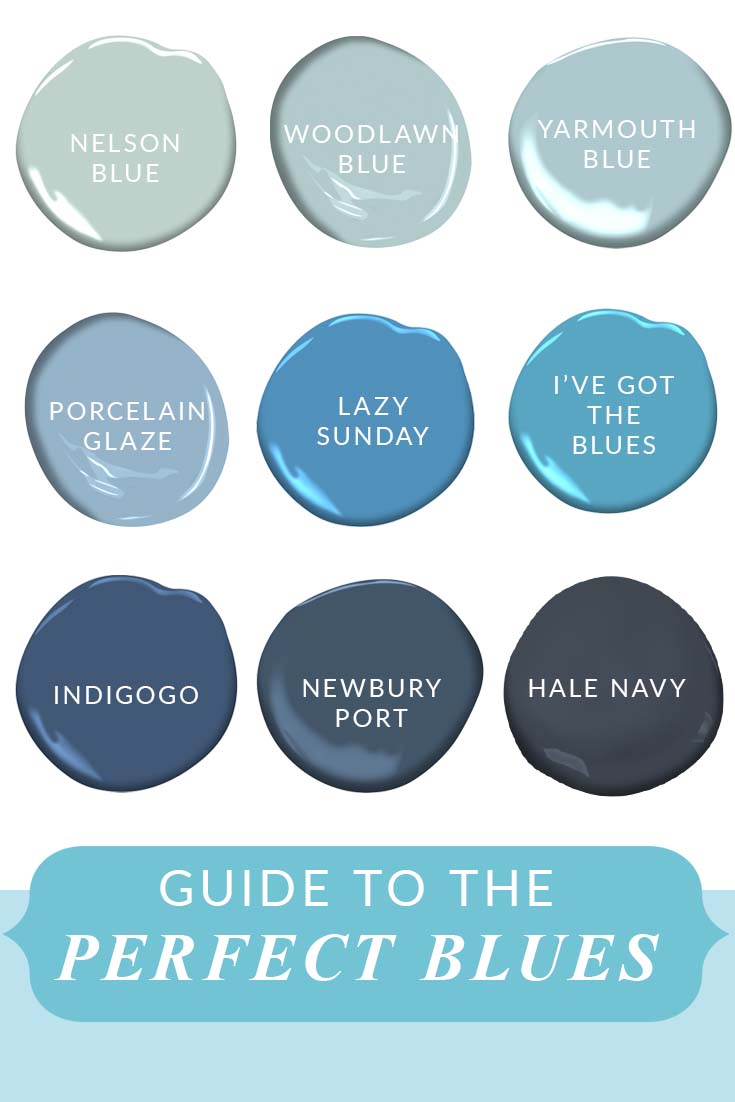
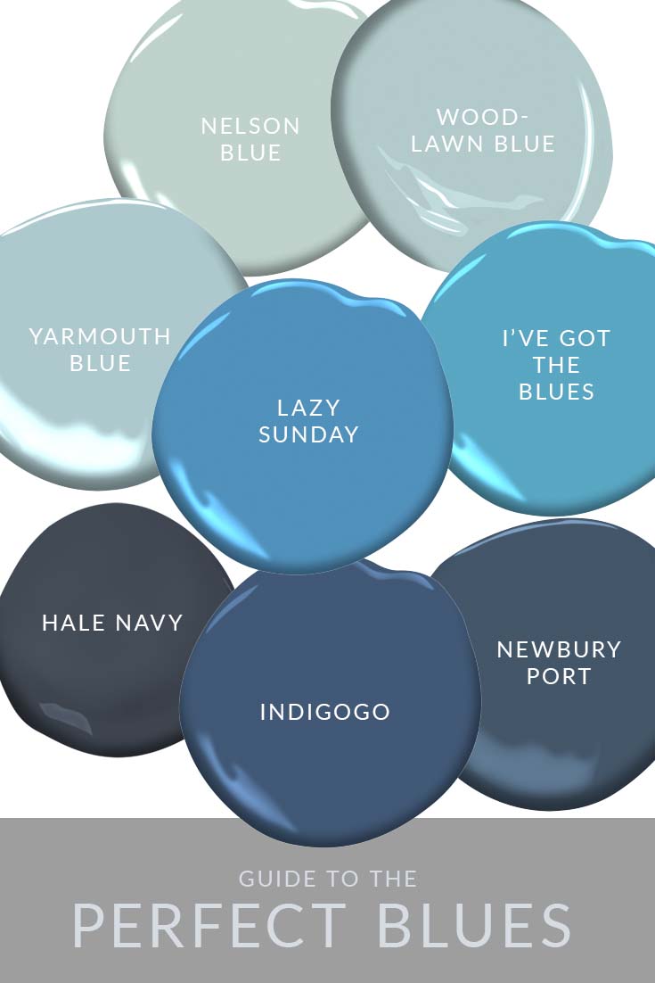
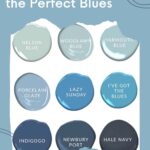
Blue is a perfect color to incorporate into your home! And we are sharing the A Guide to the Perfect Blues today. Why? Blue is serene and in today's world a calm home environment is a priority for many people. An intention for many of our clients is to have their home be a serene respite from the day to day world. Blue is found in nature in many shades! When a color is found in nature, it can function as a neutral in your home. These blue palettes not only feature some of the blues we here at LiLu love but neutrals and accents you can pair them with to create a beautiful color palette.
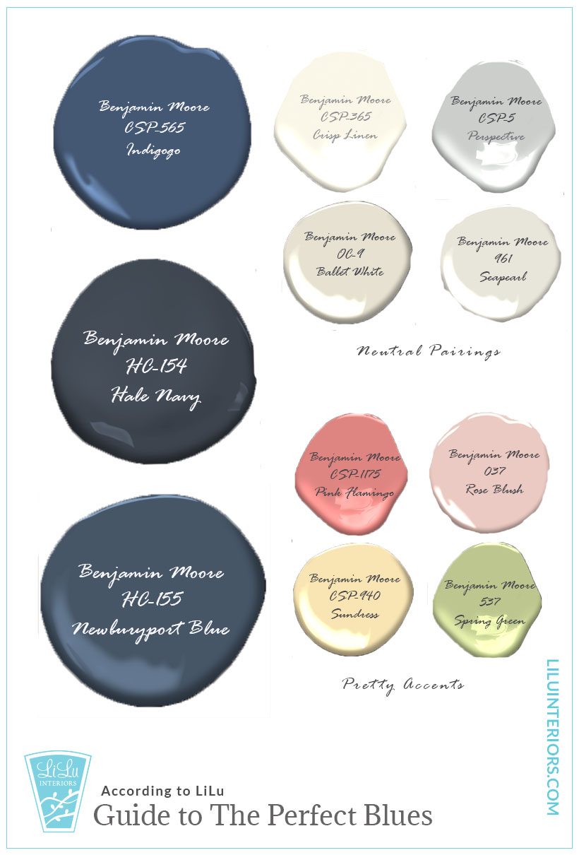
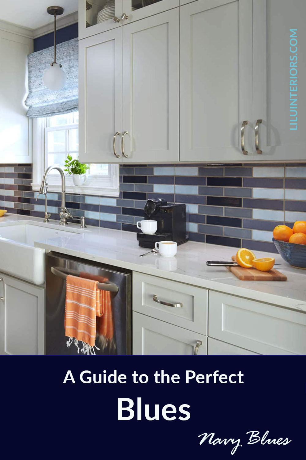
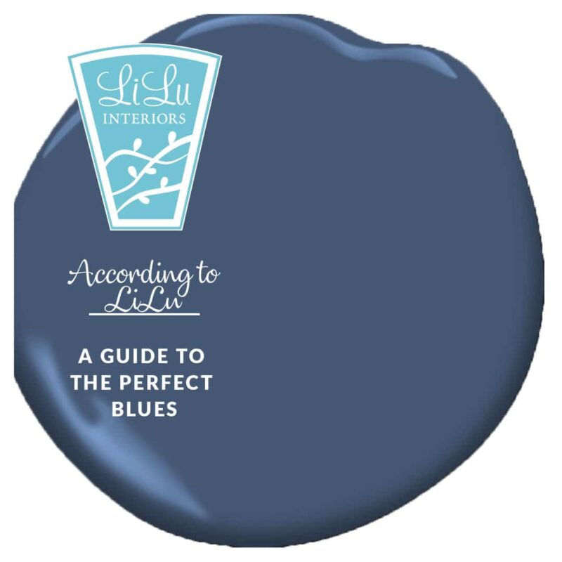
The Perfect Navy Blue
Navy blue is a classic. It is timeless and gives a sense of stability and reliability. This is why a power suit is often navy blue. Having navy as part of your home color scheme will impart that same meaning to your home. When you think of the desirable traits of home, stability is often top of mind. It's the reason Dorothy says "There's no place like home", she knew home meant the safety of love and reliability.
Navy is a great color to ground a color palette. It appeals to almost all men and mixing it with liberal doses of the neutrals and accents we've provided can give it a new sense of liveliness.
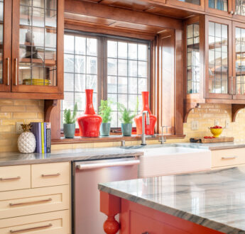
See a kitchen featuring navy in this new remodel project .
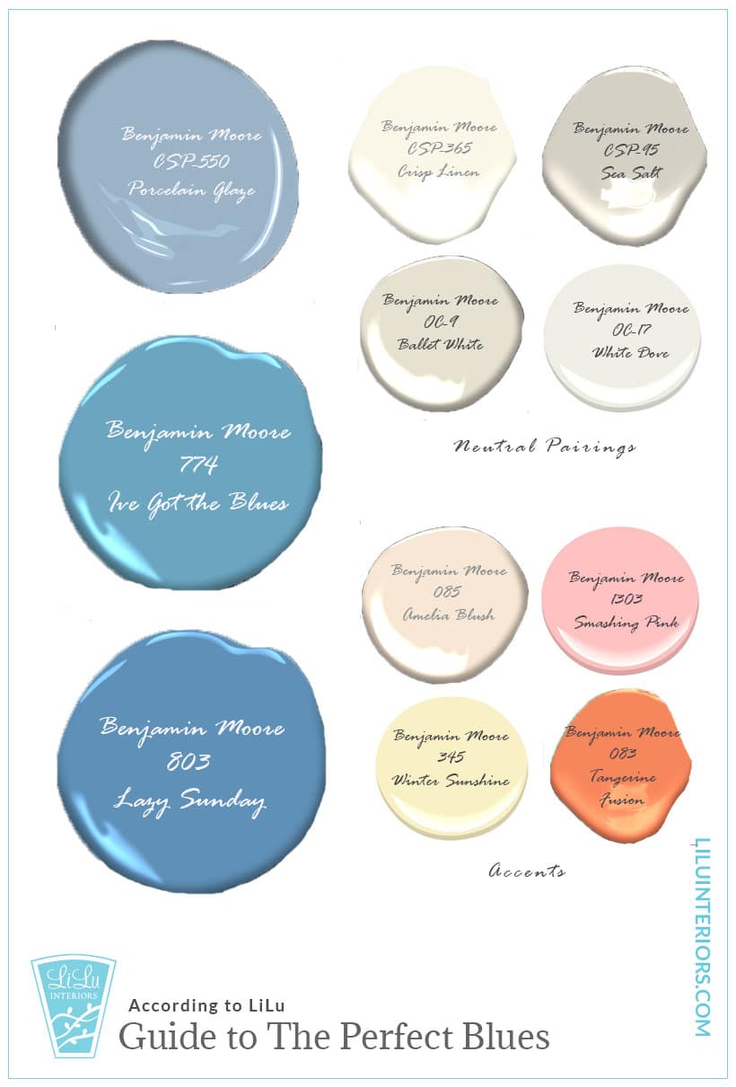
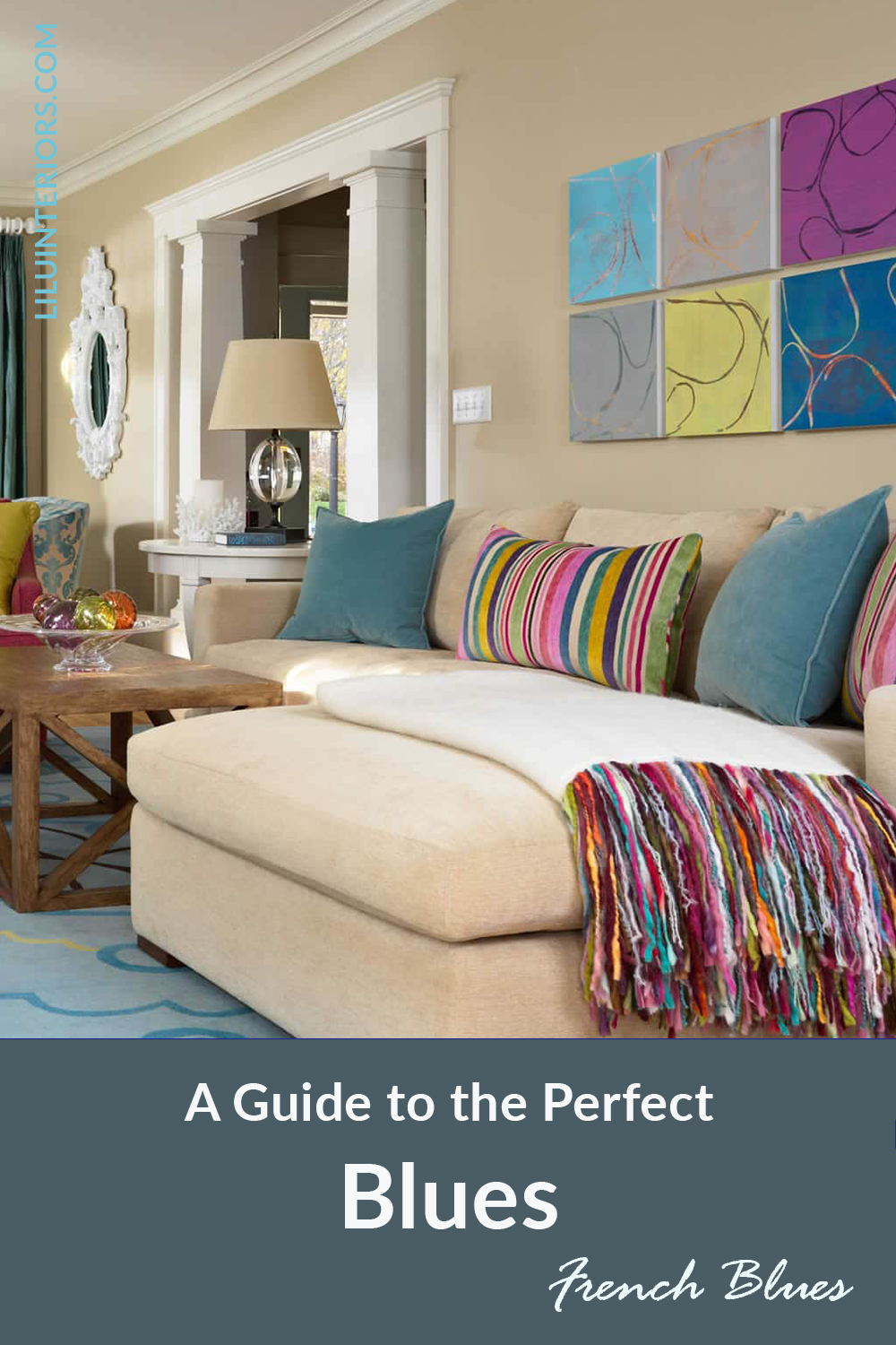
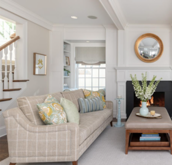
French Blues
French blues remind me of the sea and the sky. Natural and cool, these blues associated with water can feel warm for a cool color. Helping one recall days on the beach gazing at a lake or sea and the clear blue sky. Relaxing and easy they can be used to create a casual or elegant space depending on how you use them. Paired with a sunny yellow they are all about the sunny, happy vibe. When you use them with liberal amounts of white, a classic and elegant look can be achieved.
We wrote a post a bit back about Hawaiian inspired color palettes. Many of them featuring sea blues.
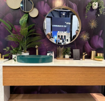
Teals
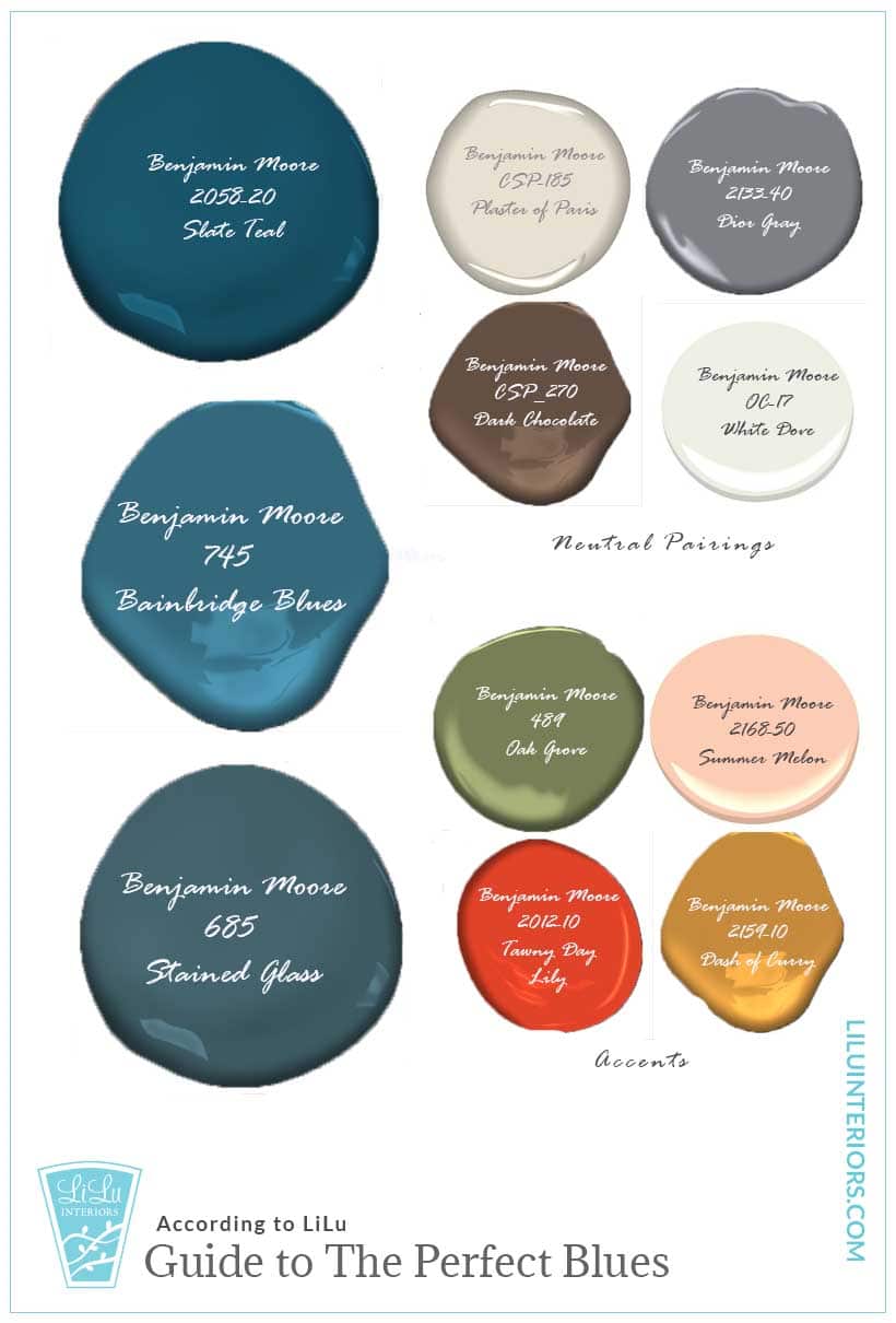
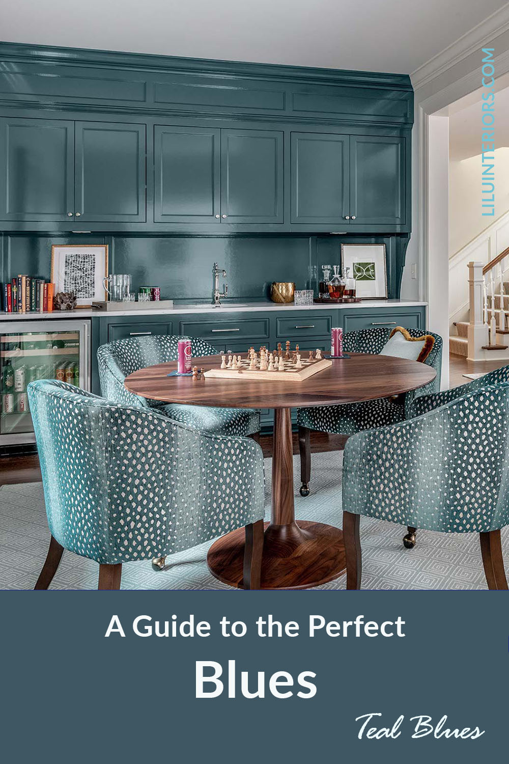
Teals are a gutsier choice for a blue. Deep and bold in the darker values we are sharing here. Both calming and energizing it is a balanced blue choice for your interior. Ever want a room, like an office or sitting room that is calm but you still feel a bit lifted? Teal is the color that can get the job done. Pair it with the deeper neutrals and accents for a serious vibe or use a touch of white, light gray or melon to have a active feeling.
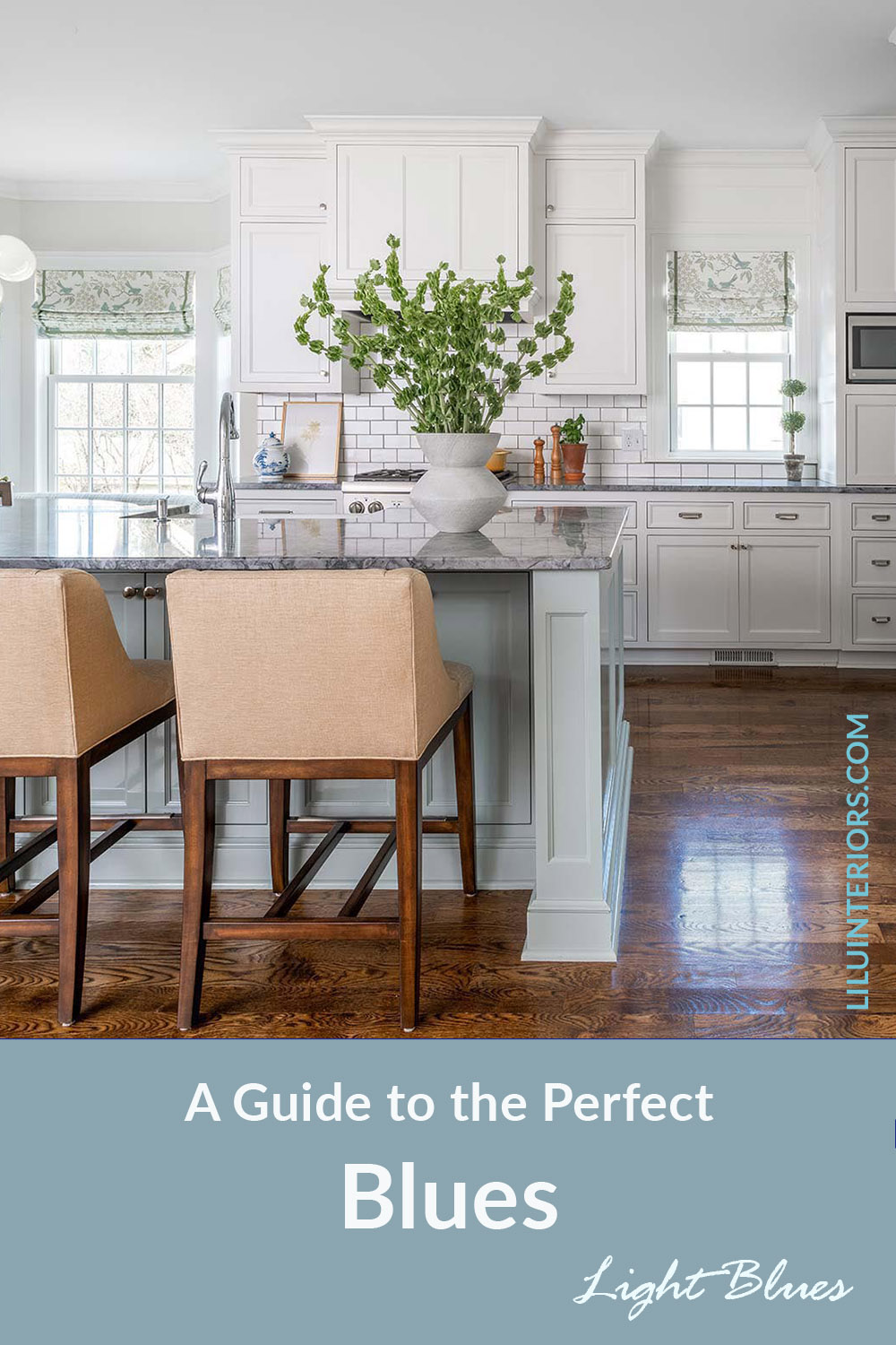
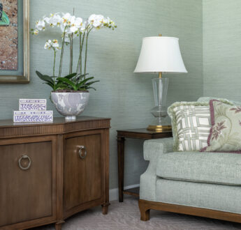
Light Blue
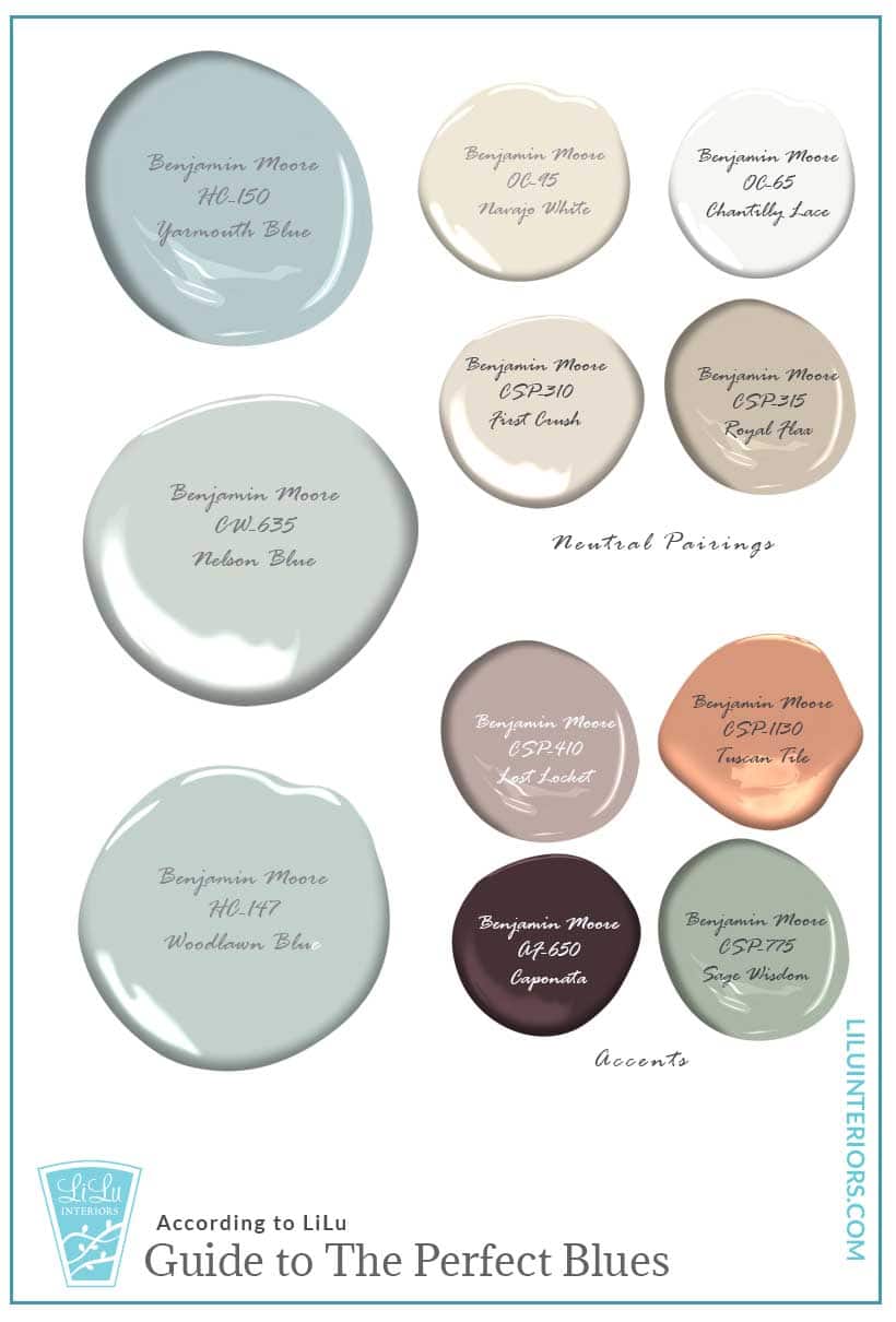
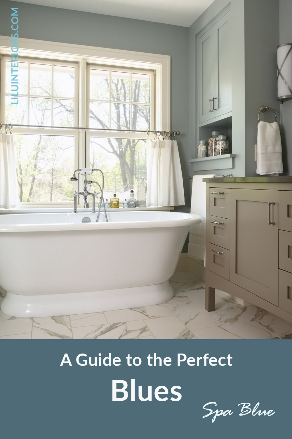
Light blue has recently been called "spa blue" It's connection to an airy sky and a softness it brings to any space makes it an ideal color to use for the ultimate in a relaxing, serene space. If you are wanting to create the ultimate relaxing vibe a monochromatic space in light blue could be the answer for you.
Explore Your True Colors
If you are exploring colors to use in your home take the quiz below to find an interior color palette with neutrals, accents, and grounding colors just for you!



13 June, 2020 at 6:11 am
Hi Lisa — What a a great guide to the best blue paint colors out there! I love it when you make things so easy to see. and thanks for the suggestions for accent colors, too.
13 June, 2020 at 7:48 am
I love the way you provide an entire palette to go with the blues! Such a great resource
13 June, 2020 at 8:34 am
What a great post and perfect timing when blue is so popular. Blue is a tricky colour because it can lean towards teal, or just when you don’t want it to it can lean towards violet. When you want blue, you want blue! You’ve chosen some of my favourites!
13 June, 2020 at 8:42 am
Beautiful palettes Lisa! Love the French blues in particular!
13 June, 2020 at 10:04 am
What beautiful color palettes!
13 June, 2020 at 2:01 pm
Nice post Lisa – some good tried and true blues and some I haven’t paid attention to before. One of my favorite Benjamin Moore blues is Gentleman’s Gray (not gray at all). You should check it out.
13 June, 2020 at 2:09 pm
I want to go and paint something now! Love all the blues!
13 June, 2020 at 5:55 pm
Love all of these blues you’ve chosen as well as the coordinating accent colors.
13 June, 2020 at 7:10 pm
Wow, there are some stunning blues in your selections that I will have to try! Love the teals and the French Blues:)
15 June, 2020 at 11:06 am
I love blue, especially the French Blues. Lisa, I adore all of the blues you chose for this blog. The pairings you have created are wonderful. We are currently using Blue Danube for a laundry room and it’s such a fun color.
15 June, 2020 at 3:13 pm
Excellent guide! Everyone loves blues, and you have selected beautiful accents that will be so helpful!
22 May, 2021 at 12:16 pm
Fabulous combinations! The teal blues are my personal favorites, but blues are always a classic choice – we are using them as the foundational color palette in a new build project we are completing right now!
22 May, 2021 at 7:38 pm
Blue is my absolute favorite color! Love that kitchen island!!
15 December, 2021 at 5:45 am
Wow! Finding this post just as I’m planning to redo nearly our entire house and finally bringing my favorite color into play. Woo hoo!