How the Heck Can I Use, Living Coral, Color of the Year?
HOW THE HECK TO USE THE COLOR OF THE YEAR
HOW TO USE LIVING CORAL-PANTONE'S COLOR OF THE YEAR
Once Pantone announces the color of the year, my phone starts ringing and cocktail party chats take a turn, the most common question I'm asked? How the heck can I use the color of the year? From journalists covering the interior design beat to friends and neighbors, everyone wants to know.
This years color is Living Coral. Which I happen to love! My daughter hates it. It's a color that is sure to create a little controversy but not as much as last years color Ultra Violet. We talked about purple in this post. Here's my best advice about the color of the year, any year, if you like it use it, if you hate it, don't use it. Want a more mellow color palette? Here a few soothing color palettes. Not every color is right for every person...and if living coral isn't right for you, feel free to stop reading! If on the other hand, you love it or you are feeling adventurous enough to try something different, please read on. We are going to offer tips on creating a color palette that uses Living Coral with other colors that can make it easy to incorporate into your interior.
FINDING A SOURCE OF INSPIRATION
If you are loving the idea of designing a room around living coral, the color of the year, the first thing you need to do is find a source of inspiration that includes the color! Because I am a designer and I love fabrics, I am going to show you four color palettes based on fabrics from some of my favorite textile designers. But you could use anything for inspiration. A photo of nature that includes the color living coral would do. Find an image you really love with more than one color.
Next you will analyze your inspiration image and determine the proportion of each color in it. If you love the image you can use it as a way to determine the amount of each color to use in your palette and your space.
Below are four very different color palettes, all featuring some amount of coral. Each palette has it's own personality from the bold and complex to the more simple palette. I hope you find these mixes and the way we've approached this inspiring.
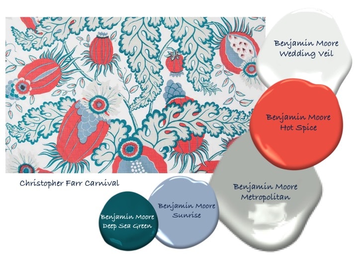
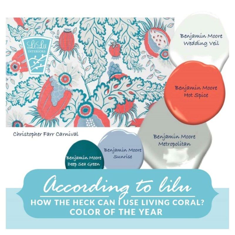
This color palette based on Christopher Farr's fabric Carnival is has two neutrals and three other colors. The fabric seems evenly balanced between coral and gray blue with an accent of teal. What I love about this is all of the work of how to balance the color in your space has been done. Just use the neutrals for the largest surfaces and pieces of furniture and have the smallest accents in teal.
In this palette the walls and major seating pieces in your room would be the neutral tones, and you might have a pair of chairs in living coral, color of the year or a stripe that combines the soft blue gray and living coral. Then accessories and pillows could be any of the accent colors with the fewest amount of the deep teal.
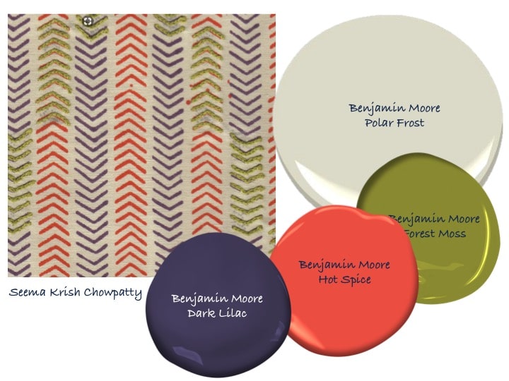
Seema Krish uses color in a more restrained way. Even in proportion and with fewer colors her Chowpatty fabric inspires a simpler color palette. While there are fewer colors, the combination of colors is unexpected and would create a lively interior.
You can see that again, the grounding force in the room you might design around this color palette would be neutral. Then each of the accent colors, the green, purple and living coral, color of the year, would be used in nearly equal amounts throughout the room. If a sofa was living coral, then a pair of chairs would be green, for example.
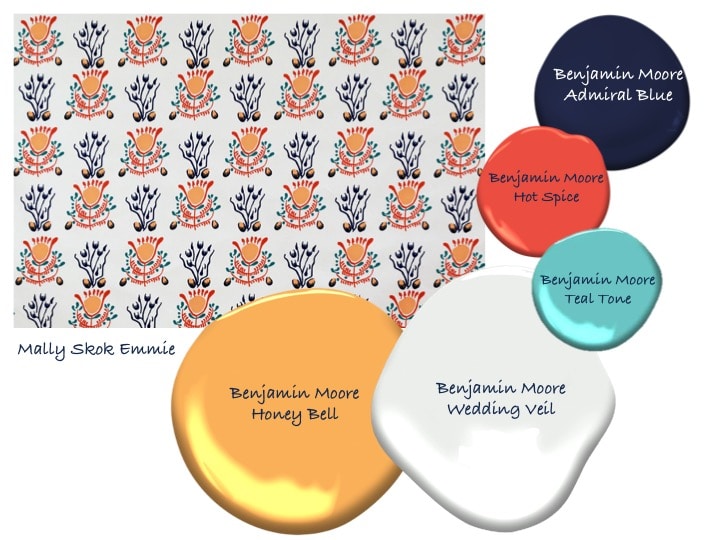
Mally Skok designs textiles influenced by her world travels. The color palette, I developed based on her Emmie fabric is rich and varied with a grounding blue. Notice the coral is a smaller note than the golden color.
In this color palette your walls and ceiling might be white with a sofa in gold, a pair of chairs in a fabric with a navy background with a floral print in living coral, light teal and gold would be a nice way of replicating the color balance in this inspiration fabric.
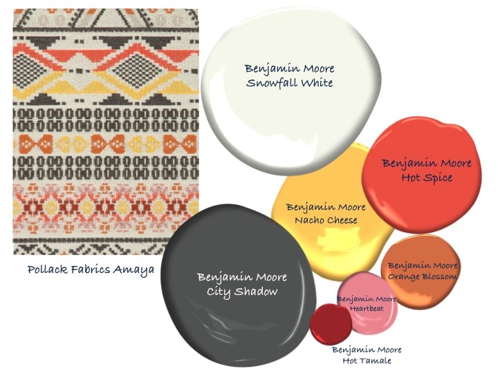
And finally, an extremely complex palette based on this beautifully woven fabric, Amaya by Pollack Associates. This complex palette could allow you to include small bits of red and terra cotta within your room. I love the idea of a low tone like the steel gray as a foil for the living coral.
This more complex color palette would allow you to incorporate a rugs and fabrics in a mix of prints with many colors.
2 February, 2019 at 12:33 pm
Great way to work out a color scheme, Lisa! And absolutely agreed – use the colors you love whether they are “in” or not!
2 February, 2019 at 3:36 pm
Glad you agree! Sometimes we hear from clients they’ve been living with colors they didn’t like because they wanted to please someone else! Life is too short!
2 February, 2019 at 12:38 pm
Love the fabric inspired color palettes! So great to see how you can make an intense color work in so many ways.
2 February, 2019 at 3:35 pm
We had fun seeing the different ways these fabulous fabric designers had used this color! Thanks for kind words!
3 February, 2019 at 8:22 am
Such fun fabric colours to illustrate pulling together a colour scheme.
3 February, 2019 at 11:09 am
Thanks Sheri!
3 February, 2019 at 9:28 am
Hi Lisa!
What pretty color palettes, and I love seeing Mally Skok’s fabric used here, but where is your own pretty textile line?
3 February, 2019 at 11:10 am
Thanks Leslie! While my line has some pretty corals, I love seeing what other designers are doing too!